Pull out your phone right now and open your own website. Does the text fit the screen? Are the buttons easy to tap with your thumb? Does anything run off the side? If you hesitated even once, you already have a reason to keep reading.
Here’s the thing most people don’t realise until it’s too late. More than half of all website visitors are browsing on a phone, not a laptop. So when someone lands on a page that looks squished, loads slowly, or forces them to pinch and zoom just to read a sentence, they leave. And every visitor who leaves takes a little bit of your search ranking with them.
The good news is that you don’t need to be a developer or spend a single rupee to fix this. This guide walks you through how to make your website mobile friendly, step by step, in plain language. We’ll start by testing where you stand, then cover the exact fixes that actually move the needle, all using free tools you can run from your browser.
What Does “Mobile Friendly” Actually Mean?
A mobile friendly website is one that adjusts itself to whatever screen it’s being viewed on. Open it on a desktop, it spreads out. Open it on a phone, it neatly stacks everything so it still reads well and works properly. No sideways scrolling, no tiny text, no buttons sitting on top of each other.
Behind the scenes, this usually comes down to something called responsive design. Instead of building a separate site for phones, your website uses flexible layouts that reshape themselves on the fly. Text resizes, images scale down, menus collapse into a tidy little icon.
There’s one more reason this matters more than it used to. Google now uses what’s called mobile-first indexing. In simple terms, Google looks at the mobile version of your site to decide how to rank you, even for people searching on a desktop. So if your mobile experience is broken, your rankings suffer everywhere, not just on phones.
First, Test Where Your Site Actually Stands
Before you fix anything, you need to know what’s broken. Guessing wastes time. There are two easy ways to check, and you should do both.
The quick manual way: open your site on your own phone and genuinely use it like a visitor would. Try to read a paragraph without zooming. Tap a few buttons. Fill in a form if you have one. Scroll through your menu. You’ll spot the obvious problems in about a minute.
The thorough way is to run an actual test. Our free Mobile Friendly Test lets you paste your URL and instantly see how your pages render across phones, tablets, and desktops. No signup, no software, no cost. It shows you exactly where a mobile visitor might struggle, so you’re not relying on your own eyes alone.
Run both checks, write down what you find, and you’ll have a clear to-do list before moving on.
Why You Can’t Use Google’s Old Mobile-Friendly Test Anymore
This trips up a lot of people, so it’s worth clearing up. For years, Google had its own free Mobile-Friendly Test tool, and it was the go-to option for everyone. You’d paste a URL, and Google would tell you pass or fail.
That tool is gone. On 1 December 2023, Google officially retired its Mobile-Friendly Test, the Mobile Usability report inside Search Console, and the testing API along with them. If you go looking for it today, you’ll just hit a dead end or get pointed toward Lighthouse, which is powerful but genuinely confusing for anyone who isn’t a developer.
So if you’ve been searching for the old Google tool and wondering why it vanished, that’s your answer. The simplest replacement for everyday users is a clean, browser-based checker. You can run your test free using our Mobile Friendly Test and skip the technical headache entirely.
How to Make Your Website Mobile Friendly: 7 Fixes That Work
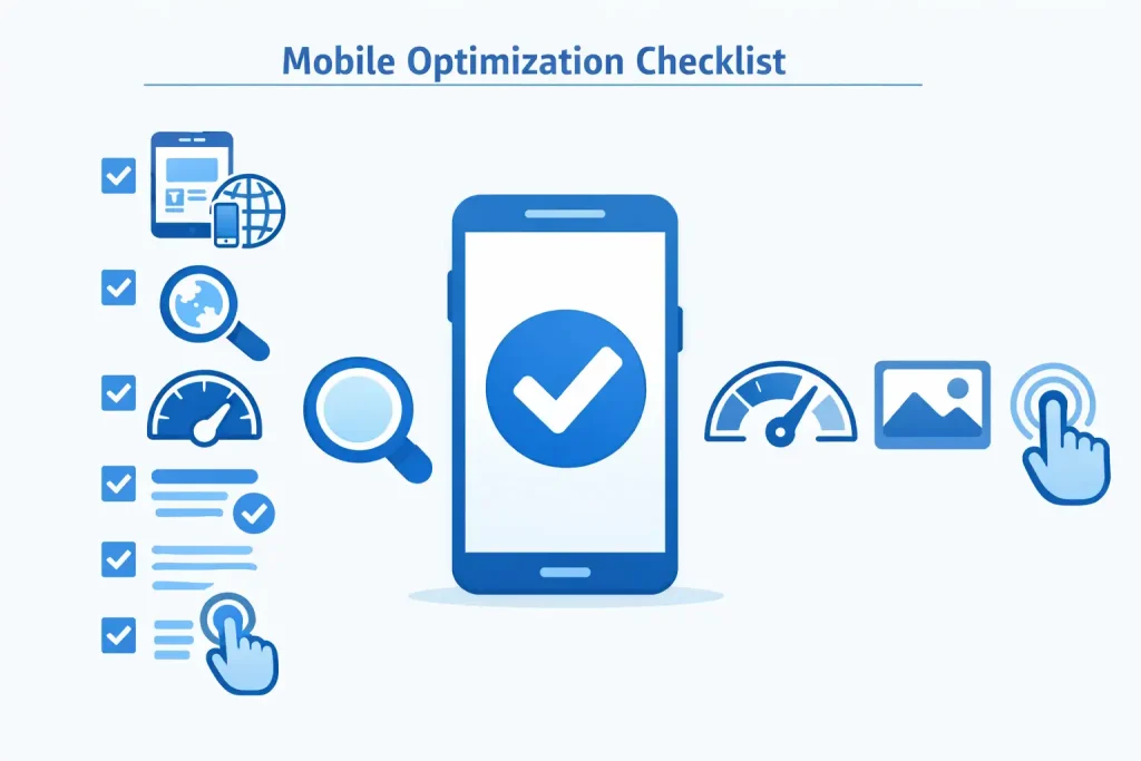
Once you know what’s wrong, here’s how to fix it. You don’t need all seven, just the ones that apply to your site. Work through them in order.
1. Add the viewport meta tag
This is the single most important line of code for mobile-friendliness, and a surprising number of older sites are missing it. It tells browsers to fit your page to the device width instead of shrinking the whole desktop version down. Add this inside the <head> of your page:
<meta name="viewport" content="width=device-width, initial-scale=1">
If you’re on WordPress with a modern theme, this is usually already handled. If your site predates 2018 or uses a custom build, check for it first.
2. Switch to a responsive theme or layout
If your whole layout is built with fixed pixel widths, no amount of small tweaks will save it. A page designed at a fixed 980 pixels will always look broken on a 380-pixel phone screen. The cleanest fix is moving to a responsive theme that adapts automatically. On platforms like WordPress, switching to a well-coded responsive theme can solve most of your mobile problems in one move.
3. Make your text readable without zooming
Tiny fonts are one of the most common complaints on mobile. If a visitor has to zoom in to read your paragraphs, you’ve already lost them. Use font sizes that scale comfortably on small screens, keep your line spacing generous, and avoid cramming text edge to edge. Readable beats clever every time.
4. Fix buttons and links that are too close together
On a desktop you click with a precise cursor. On a phone, people tap with a thumb. When buttons or links sit too close together, visitors keep hitting the wrong one, and that frustration adds up fast. Give your clickable elements more breathing room and make them big enough to tap confidently.
5. Speed up your mobile loading time
Phones often run on slower mobile data, so a page that loads fine on your office WiFi can crawl on a 4G connection. Slow pages don’t just annoy people, they drag down your rankings too. Start by finding out exactly what’s slowing you down. Our Google PageSpeed Insights Checker shows you the specific bottlenecks and gives you a real score to work against.
6. Compress your heavy images
Oversized images are the number one reason most sites load slowly on mobile. A single uncompressed photo can be several megabytes, which is brutal on a phone connection. Shrinking your images down before uploading makes an immediate difference without hurting quality. Run them through our free Image Compressor first, and you’ll often cut your page weight in half.
7. Tame your popups
Popups that cover the entire screen on a phone, with a close button so small you can barely find it, are a fast way to lose visitors. Google actively dislikes intrusive popups on mobile too. If you must use them, make them easy to close, keep them small, and delay them so they only appear after someone has shown real interest in your content.
Don’t Forget the SEO Side of Mobile-Friendliness

Making your site look good on a phone is half the job. The other half is making sure search engines can properly see and rank that mobile-friendly version.
Because of mobile-first indexing, Google is judging your site through a mobile lens. So once your pages render well, it’s worth checking the bigger picture. A quick scan with our Free Website SEO Audit helps you catch issues beyond mobile layout, things like broken structure or missing tags that quietly hold rankings back.
It’s also smart to confirm your pages are actually being indexed. Use the Google Index Checker to make sure Google has your pages listed, and if you find gaps, a clean Sitemap Generator file helps search engines crawl everything properly. Mobile-friendliness and indexing work hand in hand, so it pays to check both.
How Often Should You Check Mobile-Friendliness?
Mobile-friendliness isn’t a one-and-done task. Every time you change your theme, add a new plugin, redesign a page, or update your popups, something can quietly break on mobile without you noticing on desktop.
A good rule of thumb is to test after any major change, and then do a routine check roughly once a month. It takes a couple of minutes with our Mobile Friendly Test, and catching a problem early is far easier than wondering why your traffic slowly slipped away.
Final Thoughts
Making your website mobile friendly isn’t some massive technical project reserved for developers. For most sites, it comes down to a handful of practical fixes: a viewport tag, a responsive layout, readable text, tappable buttons, faster loading, and lighter images. Knock those out and you’ve solved the vast majority of mobile problems.
Start by testing your site so you know exactly what needs attention, work through the fixes that apply to you, and recheck after every big change. Your visitors get a smoother experience, and Google rewards you for it. Go ahead and run your free test now, your future rankings will thank you.
Frequently Asked Questions
How do I know if my website is mobile friendly?
Open it on your phone and try using it, then run a free mobile friendly test to confirm how it renders across devices.
Is making a website mobile friendly free?
Yes, most fixes like adding a viewport tag, compressing images, and using a responsive theme cost nothing.
Does mobile-friendliness affect my Google ranking?
Yes, Google uses mobile-first indexing, so a poor mobile experience can lower your rankings even on desktop searches.
What’s the easiest way to make a website mobile friendly?
Switch to a responsive theme, which automatically adapts your layout to fit phones, tablets, and desktops.
Why did Google remove its own Mobile-Friendly Test tool?
Google retired it on 1 December 2023 and now points users toward Lighthouse and other browser-based checkers instead.
How often should I test my website on mobile?
Test after any major change to your site, and run a routine check around once a month to stay safe.